UI Overhaul and Future Plans


As the game became playable and available with my first deploy, I realized it was time to give the UI some attention. Honestly, working on UI isn’t my favorite thing to do, but the game was looking pretty rough with the initial design I had put together. I approached the UI as a web developer, which was a mistake—it needed to feel like a game, not a web app.
I spent a lot of my spare time thinking about how to improve it. I looked at other games for inspiration and started experimenting with different ideas. Today, I’m excited to share the results of those experiments.
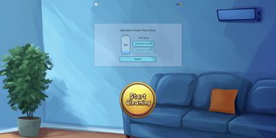
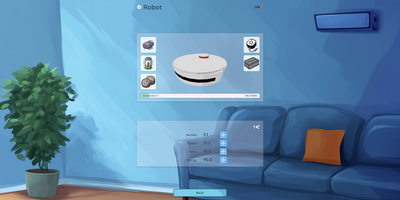
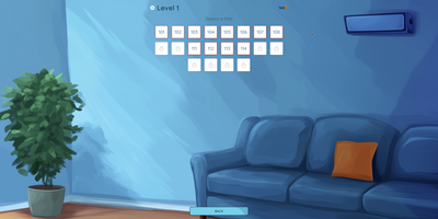
First, I decided to move away from the boring, single-color background. I asked an AI to help me create a more vibrant and decent-looking background. It’s far from perfect, but it’s already miles better than the previous one, so I’m sticking with it for now.
You’ll also notice some significant improvements in the UI elements, like the glass-style panels and a huge, beautiful "Start Cleaning" button. Another major improvement is the addition of transition animations. Now, you can see some movement in the UI, which I hope makes the game feel more alive and game-like.
One more thing I added, based on feedback, is a small mute button to disable the music while playing. It was a quick fix, though the game doesn’t yet remember to keep it off all the time—I’ll address that later. Additionally, I’ve decided to shift my focus from mobile UI to prioritize the desktop version, as Google still hasn’t verified my account. So, for now, desktop it is.
Future Plans
Initially, I planned to make a free game with ads for monetization, but after researching the game dev industry, I started doubting this approach. To make any income from ads, the game needs to be fairly popular, and I’m not confident I can achieve that. Other developers keep saying it’s nearly impossible to make a popular game without significant marketing investment, and I can’t afford any marketing at all. So, I’ve decided to scrap everything related to ads monetization.
One of the mechanics affected by this decision is temporary apartment access, where you’d need to spend coins to reopen them. With this mechanic, you could end up in a situation where all the apartments are locked, and you have no coins left. My original plan was to show an ad to give players some free coins, but since I’m moving away from ads, I’m making apartments stay open permanently once unlocked. This makes multiple keys for the same apartment redundant, so I’ll stop spawning them if the room is already open.
However, I still want to limit apartment access somehow. My current idea is to save the apartment timer state between visits and reset it with another timer. This way, you can visit the apartment multiple times if you have time left on the timer, but when it runs out, you’ll need to wait for the apartment to reset.
That’s the plan. I can’t promise this will be implemented next, as improving the visuals is my priority right now, but you can expect it soon.
That’s it for this update. Enjoy the new version, leave comments, and have a great day!
Files
World of Dust
Someone Should Clean These Houses — Time to Get Addicted to the Dust!
| Status | In development |
| Author | Siarhei_K |
| Genre | Simulation |
| Tags | 3D, Arcade, Casual, Colorful, Cozy, Exploration, Low-poly, Relaxing, Singleplayer |
| Languages | English |

Leave a comment
Log in with itch.io to leave a comment.